Happy Fall! Can’t believe the leaves are beginning to turn and the bitter morning temperatures we’ve had this week. It’s been a while since, my last post and I wanted to update you all of the progress of this semester.
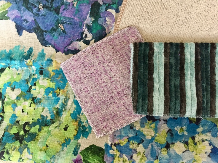
One of the projects we have been working on this semester was the Cone Health Women’s center located in Greensboro, NC for the Reception/Waiting Area and Nurses Station. The project requirements for this design were to create a women’s healthcare facility that would permit women to feel tensions relieved and a stress free environment. The color palette incorporates a neutral ivory, blues, and pops of green. Studies have shown that these colors help enhance fertility, relieve stress, and create a harmonious environment. Natural plants were brought into the interior to give texture and symbolize growth. All spaces followed ADA regulations for commercial facilities and are welcoming to women of all ages.
Concept Statement:
Moses Cone Women’s Health Center is a space of calm and tranquility, where a woman can release all tensions, stress, and apprehensions and breathe in a sense of restoration. The overall theme captures the curvature of a women’s body and the peace of the ocean emerging into the natural atmosphere of holistic medicine.
Feel free to take a glance at the Reception/Waiting Room and Nurses Station below…
Cheers,
Margaret Ann
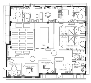
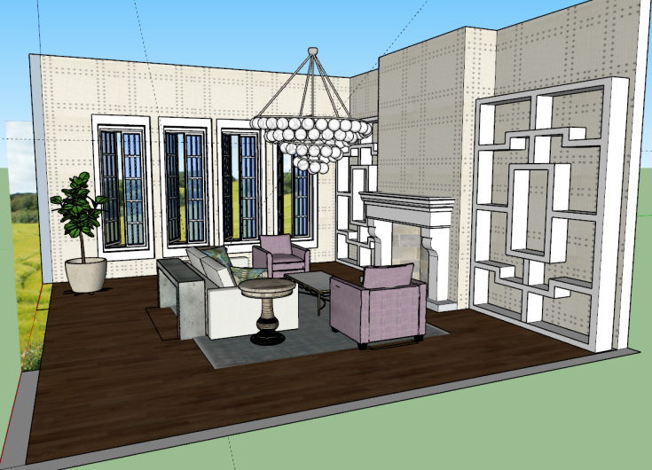
Waiting Room Perspective
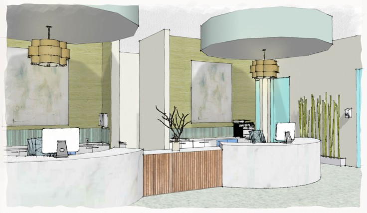
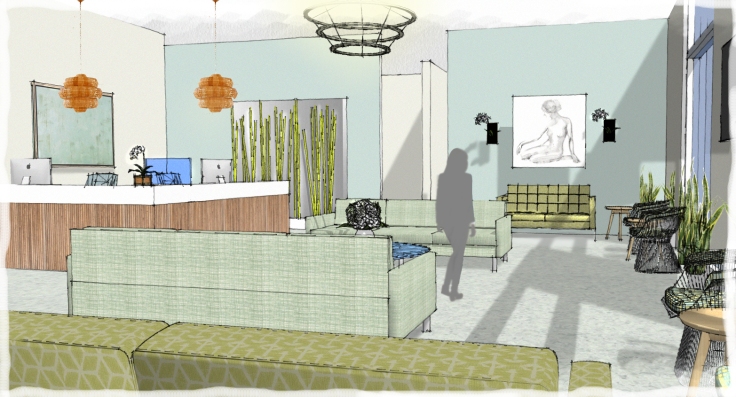
Nurses Station Perspective
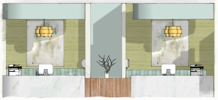
Elevation of Nurses Station